
How to Choose the Right Colours for Your Luxury Home
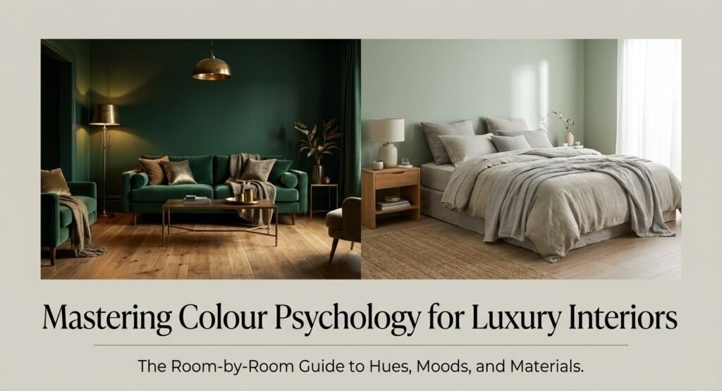
Colour psychology in interior design is how specific hues shape how you feel inside a room, often before you’ve even sat down. Get it right and a space feels expensive, calm, or intimate exactly as intended. Get it wrong and even a ₹50 lakh renovation feels off.
What is colour psychology in interior design?
Colour psychology studies how hues affect human emotion and behaviour. In interior design, it’s more specific: it’s how light, scale, material, and colour interact inside a real room.
A navy blue that feels refined in a 400 sq ft study can feel oppressive in a windowless bathroom. The colour isn’t wrong. The context is.
Warm vs cool colours: which one is right for your room?
Neither is universally better. They solve different problems.
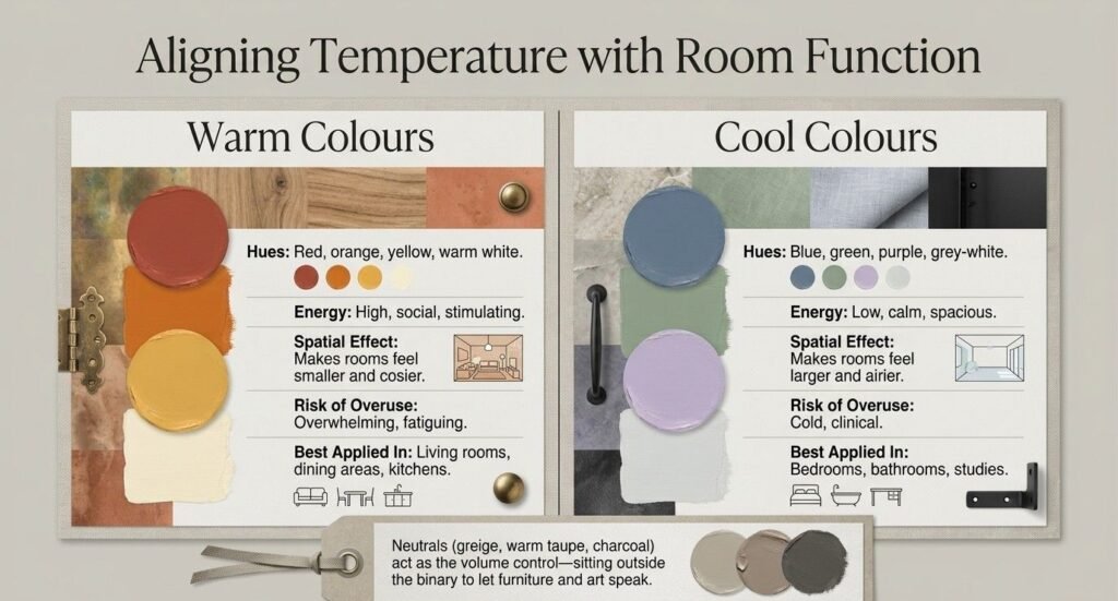
| Feature | Warm Colours | Cool Colours |
|---|---|---|
| Examples | Red, orange, yellow, warm white | Blue, green, purple, grey-white |
| Room energy | High, social, stimulating | Low, calm, spacious |
| Best rooms | Living room, dining, kitchen | Bedroom, bathroom, study |
| Light effect | Makes room feel smaller, cosier | Makes room feel larger, airier |
| Risk if overused | Overwhelming, fatiguing | Cold, clinical |
| Works best with | Natural wood, brass, terracotta | Stone, linen, matte black |
Neutrals (greige, warm taupe, soft white, charcoal) sit outside this binary. They’re the volume control they let furniture and art do the talking.
best wall colour for living room in India 2026
Living room colours: social, layered, impressive
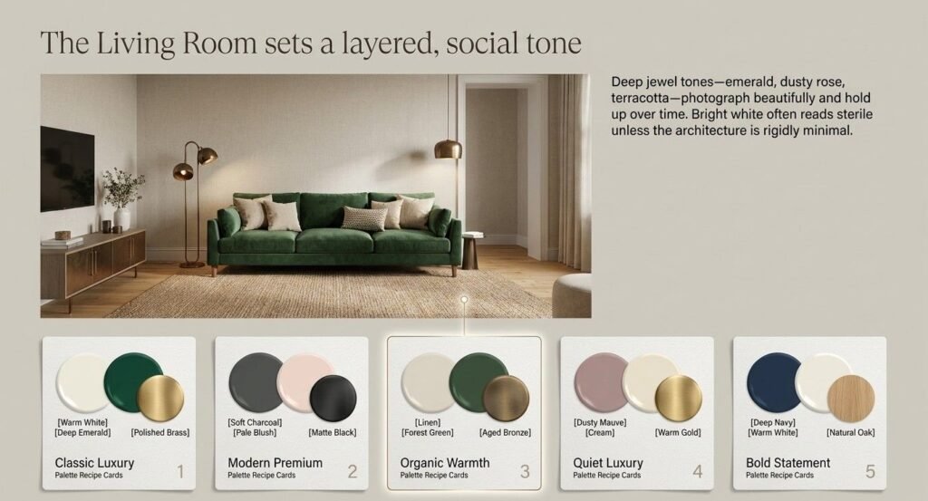
Your living room sets the tone for every guest who walks in. Deep jewel tones emerald green, dusty rose, warm terracotta photograph beautifully and hold up over time.
Avoid stark white if you want a luxury feel. Bright white reads sterile unless the architecture is genuinely minimal
Best living room colour combinations:
| Look you want | Wall colour | Accent colour | Hardware/finish |
|---|---|---|---|
| Classic luxury | Warm white / greige | Deep emerald or navy | Brass |
| Modern premium | Soft charcoal | Pale blush | Matte black |
| Organic warmth | Linen / terracotta | Forest green | Aged bronze |
| Quiet luxury | Dusty mauve | Cream | Warm gold |
| Bold statement | Deep navy | Warm white | Natural oak |
which colour is best for bedroom walls in India
Cool, muted tones earn their place here. Soft sage green, dusty mauve, warm grey, and deep charcoal all perform well.
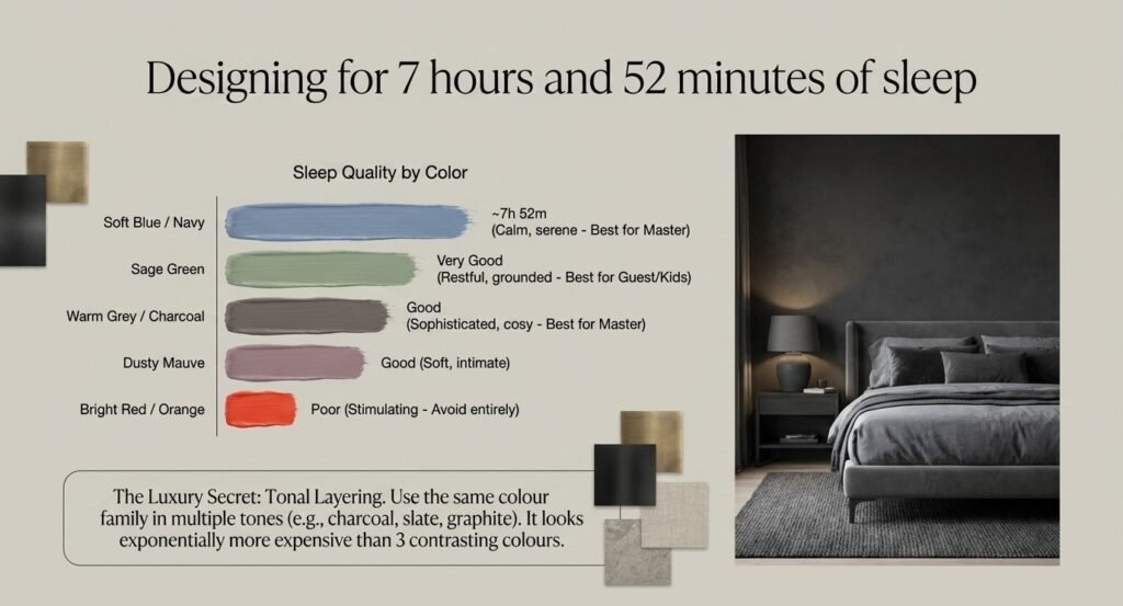
Research from the University of Sussex found blue bedrooms produced the most sleep averaging 7 hours 52 minutes a night. Red and purple rooms performed worst.
| Colour | Mood it creates | Sleep quality | Best for |
|---|---|---|---|
| Soft blue / navy | Calm, serene | Best | Master bedroom |
| Sage green | Restful, grounded | Very good | Guest room, kids room |
| Warm grey / charcoal | Sophisticated, cosy | Good | Master bedroom |
| Dusty mauve | Soft, intimate | Good | Bedroom, dressing area |
| Bright red / orange | Stimulating, energising | Poor | Avoid in bedroom |
| Pure white | Clean but clinical | Average | Works only with warm lighting |
For a luxury bedroom, use tonal layering: same colour family, multiple tones. A charcoal wall with slate grey linen and graphite velvet cushions looks expensive in a way that 3 contrasting colours never do.
best kitchen wall colour Indian home modular kitchen
Kitchen colours: appetite, energy, cleanliness
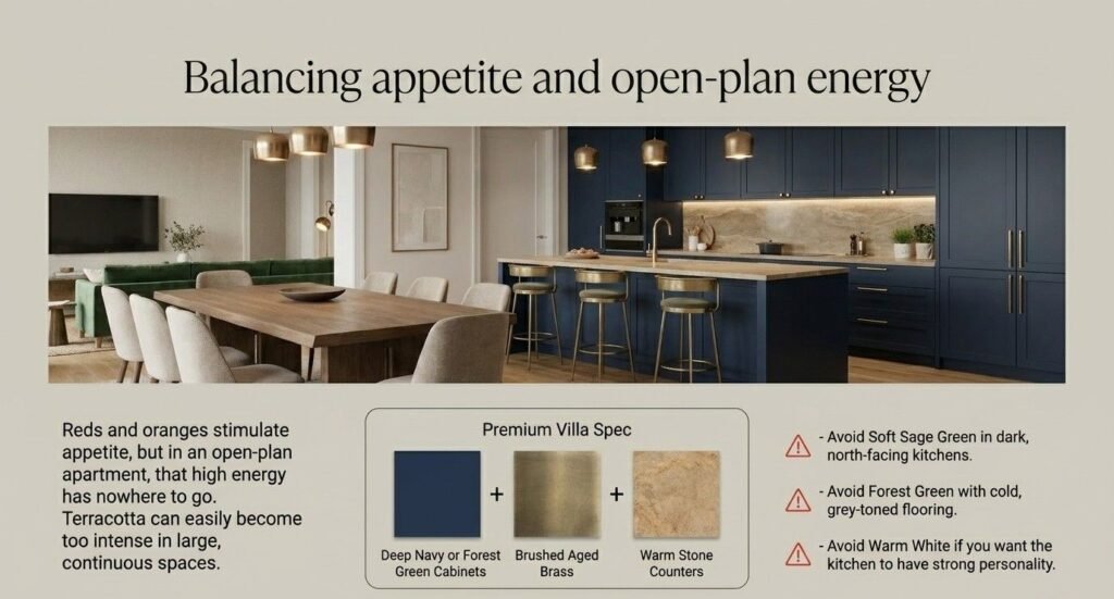
Kitchens are tricky. Reds and oranges genuinely stimulate appetite this is documented, not a design myth. But in an open-plan Pune apartment where the kitchen flows into the dining area, that energy has nowhere to go.
| Colour | Effect | Works with | Avoid if |
|---|---|---|---|
| Warm white | Clean, fresh, timeless | Any cabinet finish | You want personality |
| Soft sage green | Calm, organic, modern | Wood, brass, stone | Dark, north-facing kitchen |
| Deep navy (cabinets) | Dramatic, luxurious | Brass hardware, warm counters | Very small kitchen |
| Forest green (cabinets) | Organic, rich, trending | Natural rattan, terracotta | Cold, grey-toned flooring |
| Terracotta | Warm, earthy, inviting | White walls, copper | Large open kitchens (too intense) |
Deep navy or forest green kitchen cabinets with brass hardware and warm stone countertops that’s the combination Xclusive Interiors keeps specifying in Pune villa projects right now. And it deserves the attention it’s getting.
best paint colour for home office work from home productivity
Green earns its psychological reputation here. Sage, olive, and muted greens reduce eye fatigue and sustain concentration. Libraries and reading rooms have used green for centuries for exactly this reason.
| Colour | Focus level | Eye fatigue | Energy | Best pairing |
|---|---|---|---|---|
| Sage / olive green | High | Low | Medium | Natural wood, warm lighting |
| Warm grey | Medium-high | Low | Low-medium | White trim, task light |
| Soft blue | Medium | Very low | Calm | Linen, white desk |
| Bright yellow | Low | High | Very high | Avoid for long work sessions |
| White | Medium | Medium | Neutral | Works only with good art/plants |
small bathroom colour ideas India make it look bigger
For small Pune bathrooms (most city apartments have them), light colours and large-format tiles create the illusion of space. A single dark accent wall behind the vanity adds depth without shrinking the room.
| Goal | Best colour choice | What to avoid |
|---|---|---|
| Make it look bigger | Soft white, pale blue-green, light greige | Dark all-over colour |
| Spa / luxury feel | Warm white + deep charcoal accent | Bright, saturated tones |
| Bold and dramatic | Deep green or navy feature wall | Covering all 4 walls in dark colour |
| Budget refresh | Repaint in warm white, change hardware | Matching tiles + walls exactly |
Colours that make a home look expensive
Some colour choices read as high-end before you even factor in materials.
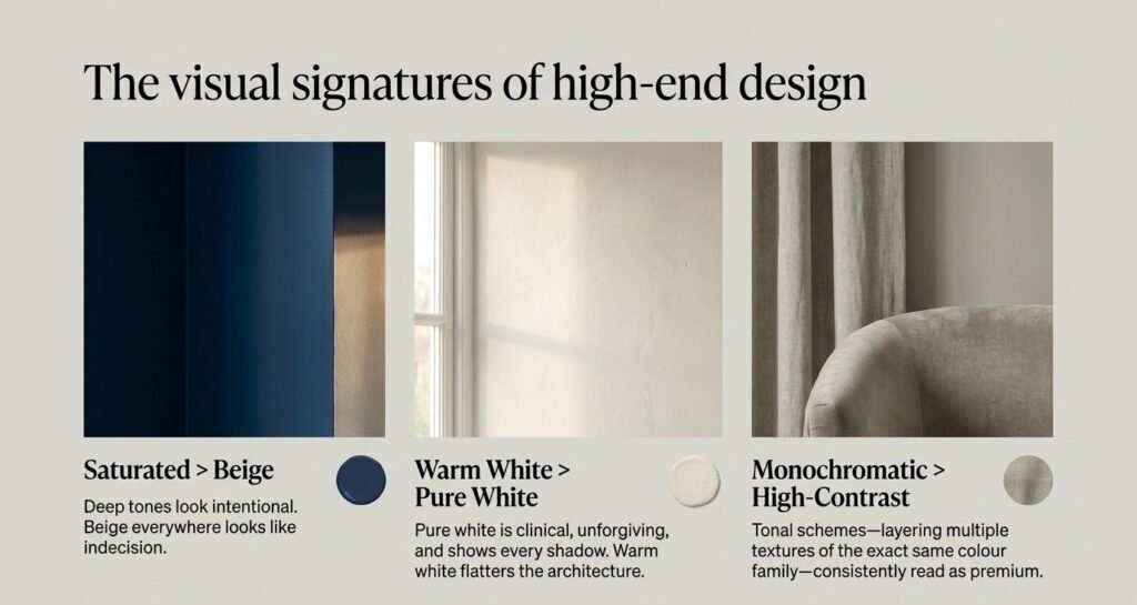
Deep, saturated wall tones (navy, forest green, charcoal) look intentional. Beige-everything rooms look like the owner couldn’t decide.
Warm whites over pure white almost always. Pure white is unforgiving. Every scuff and shadow shows. A warm white flatters both the room and the people in it.
Monochromatic tonal schemes look more expensive than high-contrast ones. Same colour family, multiple tones and textures, across walls and soft furnishings. This is what the interior designers at Xclusive Interiors consistently use in premium villa projects across Pune.
Colour mistakes that kill the luxury feel
| Mistake | Why it fails | Fix |
|---|---|---|
| Too many colours in one room | Reads chaotic, not curated | Max 3: dominant (60%), secondary (30%), accent (10%) |
| Choosing colour by phone/screen | Screens are calibrated differently | Test on the actual wall, in actual light, for 48 hours |
| Ignoring undertones | A “grey” can read purple, green, or blue on a wall | Test alongside your fixed flooring and furniture |
| Pure bright white walls | Clinical, unforgiving, ages poorly | Use warm white — even a hint of cream changes everything |
| Matching instead of coordinating | Flat, manufactured look | Same colour family, different tones and textures |
| Colour decided last | Fights with existing furniture and floors | Decide colour in the first design conversation, not the last |
Warm vs cool colours for specific Indian home types
Pune light is specific. The city gets strong, warm sunlight for most of the year. That changes how colours behave on your walls.
Cool tones that look washed out in London light look clear and confident here. Warm tones can intensify under Pune sunlight and tip into overwhelming.
| Home type | Light condition | Recommended palette |
|---|---|---|
| Pune apartment, east-facing | Strong morning sun | Cool whites, soft blues, sage green |
| Pune apartment, west-facing | Warm afternoon light | Cool-leaning neutrals, dusty mauve |
| Villa with large windows (Baner, Viman Nagar) | Bright, all-day | Deep jewel tones, can handle saturation |
| North-facing flat, low light | Dim, cool light | Warm whites, terracotta, warm yellows |
| Open-plan living + kitchen | Mixed light | Continuous neutral base, accents in defined zones |
Test shortlisted colours at morning, afternoon, and evening light in your actual space before committing. This single step saves most repainting regrets.
Expert tips from Xclusive Interiors designers
After 200+ luxury residential projects in Pune, a few things come up constantly.
Ceilings are underestimated. White ceilings in a deeply coloured room create a jarring break. A slightly toned version of the wall colour on the ceiling makes a room feel taller and more cohesive.
Undertones matter more than the colour itself. A “neutral grey” with a purple undertone and a “neutral grey” with a green undertone look completely different on a wall. This is where working with an experienced designer saves real money.
Colour should be the first conversation, not the last. The single most common mistake Xclusive Interiors sees: picking colour after all the furniture and flooring is already in. It limits every decision that follows.
Quick colour reference: which colour does what
| Colour | Primary Emotion | Room Best Suited | Avoid In |
|---|---|---|---|
| Red | Energy, passion, appetite | Dining room, accent wall | Bedroom, home office |
| Orange | Warmth, social energy | Living room, dining | Bedroom, bathroom |
| Yellow | Optimism, attention | Kitchen, entryway | Large rooms as main colour |
| Green | Calm, focus, restoration | Bedroom, study, bathroom | N/A — very versatile |
| Blue | Trust, calm, sleep | Bedroom, bathroom, study | North-facing dark rooms |
| Purple | Luxury, creativity | Bedroom accent, dressing | Main living room colour |
| Charcoal / Black | Depth, sophistication | Feature wall, study | Small dark rooms |
| Warm White | Timeless, clean, welcoming | Every room | N/A — universal base |
| Terracotta | Earthy, warm, grounded | Living room, kitchen | Cold or north-facing rooms |
Frequently asked questions about colour psychology in interior design
Q1. What is colour psychology in interior design?
Colour psychology in interior design is the science of how colours influence mood, behaviour, and perception inside a space. Blues calm, reds stimulate appetite and energy, greens reduce eye fatigue, and warm neutrals create a sense of welcome and comfort.
Q2. Which colour is best for a living room in India?
Warm neutrals like greige, soft ivory, and warm white work well as base colours in Indian living rooms. Pair them with one deep accent tone like emerald, terracotta, or dusty rose for a rich, layered result that photographs well and ages beautifully.
Q3. Which colour makes a small room look bigger?
Light, cool tones and soft neutrals make small rooms appear larger. Large-format tiles, minimal contrast between walls and trim, and good lighting amplify the effect. Avoid matching the wall and floor colour exactly it flattens the space.
Q4. What colour should you avoid in a bedroom?
Avoid bright reds, oranges, and high-saturation purples in bedrooms. These are stimulating colours that interfere with sleep quality. Opt for muted blues, soft greens, warm greys, or dusty mauve instead.
Q5. What colours look luxurious in an interior?
Deep jewel tones (navy, forest green, charcoal), warm whites, and monochromatic tonal schemes consistently read as luxurious. Pairing these with quality materials like brass, natural stone, and textured linen makes the effect stronger without adding more colour.
Q6. How do warm and cool colours differ in interior design?
Warm colours (reds, oranges, yellows) raise energy and make spaces feel cosier and more social. Cool colours (blues, greens, greys) lower stress and make spaces feel calmer and more spacious. The choice depends on the room’s function and available natural light.
Q7. Does wall colour really affect mood?
Yes. Research consistently shows colour influences heart rate, stress levels, appetite, and concentration. Blue rooms improve sleep duration. Green reduces eye strain during focused work. Red and orange increase social energy and appetite which is why so many restaurants use them.
Q8. How many colours should you use in one room?
3 is the standard rule: one dominant colour covering about 60% of the room, one secondary at 30%, and one accent at 10%. Going beyond 3 without a clear tonal framework reads as cluttered, not curated.
Q9. What is the 60-30-10 colour rule in interior design?
The 60-30-10 rule is a proportion guide for balancing colour in a room. 60% goes to the dominant colour (usually walls), 30% to a secondary (furniture, rugs), and 10% to an accent (cushions, art, hardware). It creates visual balance without making the room feel flat.
Q10. Which colour is best for a home office in India?
Sage green, warm grey, and soft blue are the strongest choices for home offices. They reduce eye fatigue, maintain focus, and keep energy levels steady over long work sessions. Avoid bright yellows and high-saturation tones they’re too stimulating for sustained concentration.
Ready to get colour right in your home?
Colour psychology in interior design takes the guesswork out of one of the most expensive decisions in any renovation. The right colour, chosen at the right stage, makes everything else furniture, lighting, materials work harder.
Whether you’re designing a single bedroom or a full Pune villa, Xclusive Interiors will walk you through colour selection grounded in your home’s actual light, layout, and lifestyle.
Book a free consultation with Xclusive Interiors today and get a colour plan that makes your home feel exactly the way you want it to.