Colour Psychology in Villa Interiors: What Works and Why
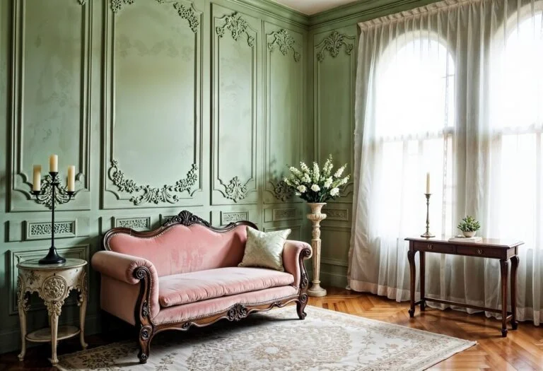
Table of Contents
- Why Colour Psychology Is Critical in Villa Design
- Neutral Foundations That Whisper Luxury
- Blues That Calm and Inspire
- Earthy Greens That Connect With Nature
- Whites That Expand and Enhance Light
- Accents That Add Personality
- Texture and Lighting: The Hidden Players
- Inspiration That Crosses Over into Apartments
- Final Thoughts
When it comes to villa interiors, colour isn’t just about aesthetics; it’s about emotion, energy, and atmosphere. Every shade you choose has the power to influence how a space feels, how people interact within it, and how the home reflects your personality. Unlike apartments, where space constraints often dictate function-first design, villas offer the creative freedom to let colour shape every corner in bold and expressive ways. Interestingly, many homeowners also draw interior design ideas for apartment living from villa-style palettes, applying these colour strategies on a smaller scale to achieve a similar emotional impact. This is where colour psychology becomes a powerful tool.
Colour psychology is the study of how hues affect mood, behaviour, and perception. In luxury villa design, this understanding is key to creating interiors that not only look spectacular but also feel deeply comforting, elegant, or energising—depending on the space’s intended use.
Why Colour Psychology Is Critical in Villa Design
Villas typically feature expansive layouts—double-height ceilings, open living spaces, wide corridors, and outdoor-indoor blends. With all this room to play, the colour palette doesn’t just serve a visual purpose. It sets emotional tone and spatial rhythm.
Soft tones can make large spaces feel cozy and intimate, while bold, rich colours lend character and drama. Well-chosen colours anchor each zone with intent—calming the bedroom, stimulating conversation in the lounge, or evoking luxury in the powder room. When colour decisions are rooted in psychology, the villa becomes more than a home; it becomes an immersive experience.
Neutral Foundations That Whisper Luxury
Neutral palettes have long been favoured in high-end interiors for good reason. Shades like ivory, warm greys, bone, sand, and pale latte create an effortlessly elegant canvas that feels timeless. But neutral doesn’t mean boring—it means balance.
Neutrals allow architectural elements and furnishings to stand out. In villas, where intricate mouldings, statement lighting, and art pieces often feature prominently, a soft background colour lets these details breathe. More importantly, these shades offer emotional calm. They don’t compete for attention; instead, they invite you in and wrap you in comfort.
Using neutrals throughout common areas like entrance halls, staircases, and living rooms establishes continuity and flow, especially in open-plan designs. To elevate the scheme, designers layer textures—brushed wood, suede, matte metals, and polished marble—creating a tactile richness that makes neutrals feel luxurious rather than plain.
Blues That Calm and Inspire
Blue is often considered a designer’s best friend in residential interiors and for good reason. From powdery sky blue to deep navy, it brings a sense of peace, spaciousness, and mental clarity.
In villa bedrooms, where relaxation is essential, soft blues are often used to evoke calm. In home offices or private lounges, darker variations like indigo or peacock blue create depth and concentration. Blue also works well in bathrooms, often paired with white marble or slate grey, resulting in a spa-like ambience that’s perfect for unwinding.
When paired with crisp whites, brass fixtures, or soft greys, blue offers a fresh and refined look that feels coastal, classic, or contemporary, depending on the surrounding finishes.
Earthy Greens That Connect With Nature
Green is deeply grounding and often used to create a sense of balance and renewal. In villas—especially those nestled in lush surroundings or with large courtyards—green interiors help bridge the indoors and outdoors. Sage, moss, and olive tones are particularly soothing and suit spaces intended for relaxation and rejuvenation.
Imagine a reading nook painted in dusty green, filled with natural sunlight and organic fabrics—it instantly becomes a restful retreat. Even if you’re looking for interior design ideas for apartment living, incorporating soft greens and natural textures can bring that same restful, biophilic charm into compact spaces.
On the other hand, deep emerald accents in a formal dining area or lounge can create a rich, indulgent atmosphere that feels polished yet organic. Green also pairs beautifully with natural elements like rattan, linen, and walnut wood—making it a favourite in villas and adaptable in apartments where biophilic design is key.
Whites That Expand and Enhance Light
White is often the default colour in architecture, but when chosen wisely, it can transform villa interiors into sanctuaries of light and air. The beauty of white lies in their versatility. Soft white walls can enhance natural light, make rooms feel bigger, and provide a clean backdrop for bold furniture or artwork.
In villas with high ceilings or large windows, white intensifies the feeling of space and openness. It also helps reflect the lush greens and sky blues visible through French windows or garden-facing walls, integrating the outside view into the interior aesthetic.
To avoid a sterile look, designers often warm up white spaces with gold accents, wooden beams, or rich textiles. The result is minimalist luxury—restrained, thoughtful, and Instagram-worthy.
Accents That Add Personality
While your main palette might lean toward calming neutrals or soft shades, accent colours bring contrast, drama, and energy. In villa interiors, where scale allows for expressive design, accent walls, upholstery, or art installations in bold hues can define a room.
Terracotta adds earthy warmth to living rooms or outdoor verandas. Burgundy feels regal in libraries or bar lounges. Charcoal or matte black, when used in moderation, brings sophistication and edge—especially in kitchens and staircases. Gold, a perennial favourite in premium design, adds an opulent touch when used in lighting, frames, or hardware.
These accent hues are best introduced through accessories, furniture, or one feature wall. The trick is balance—too much can overwhelm, but just enough creates impact.
Texture and Lighting: The Hidden Players
Colour never exists in isolation. In villa interiors, texture and lighting dramatically affect how colour is perceived. A dusty pink may feel warm and comforting in natural morning light, but under artificial evening lights, it might read as muted or brownish.
This is why apartment interior designers test paint swatches across times of day and layer materials that play with reflection and shadow. Velvet absorbs light and deepens colour, while silk or gloss surfaces reflect it and make hues shimmer.
Strategic lighting—such as concealed LEDs, pendant chandeliers, or wall sconces—can accentuate colour in luxurious ways. When lighting and colour are aligned, rooms feel harmonious, emotionally resonant, and visually stunning.
Inspiration That Crosses Over into Apartments
While this blog focuses on villa interiors, many of these principles are also sought after by homeowners looking for interior design ideas for apartment styling. Even in a compact flat, colour psychology can influence how open or cozy a room feels. A villa’s soft green bedroom might inspire an apartment’s sage-toned reading corner. A neutral, textured living space in a villa could serve as a Pinterest-perfect mood board for an urban apartment redecoration.
By observing how colour functions across larger, more expressive spaces, apartment owners can adopt scaled-down versions of these high-end palettes—without losing their emotional or visual power.
Final Thoughts
The most exquisite villa interiors are not just built—they’re felt. They evoke emotions, create memories, and reflect the personalities of those who live in them. Colour is a vital part of that storytelling. When used with psychological insight, colour elevates the home from a series of rooms to a flowing narrative of lifestyle, luxury, and meaning.
Whether you’re planning a new villa project or exploring interior design ideas for apartment living that channel the same emotional depth, understanding the psychological impact of colour helps you make confident, timeless choices. After all, a beautiful home isn’t just about how it looks—it’s about how it makes you feel.
Want your villa interiors to reflect the perfect balance of emotion, style, and luxury?
At Xclusive Interiors, we design every space with thoughtful colour psychology, timeless taste, and high-end detailing—turning your vision into an elegant reality.